Do you remember Google I/O in the summer of 2014?
Android was just climbing out of the clunky, utilitarian ditch of versions 2.3 and 4.0, while the entire tech industry was still marveling at the clean, flat look of Apple’s iOS 7. Right at that pivotal moment, Matías Duarte walked onto the stage in his famously loud patterned shirt and unveiled Material Design.
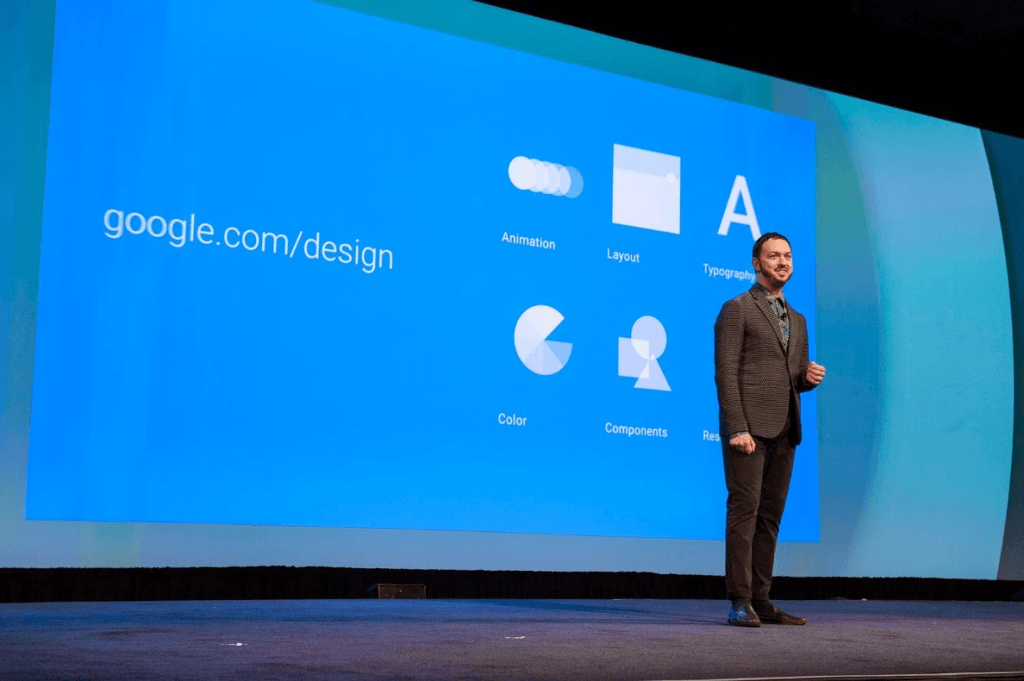
Photo: Matías Duarte announcing Material Design, Google's ambitious new visual language, at Google I/O 2014.
The keynote was staged like high theater. From virtual paper and digital ink to quantum materials and diffuse light reflection, Google went so far as to calculate initial physical velocities for touch-ripple animations. The official blog followed up with a line that echoed across Silicon Valley: “One consistent design that spans devices”—a singular design language uniting mobile, tablet, desktop, and the web. Back then, designers and developers in the audience listened with racing pulses, genuinely convinced that Google was drafting a self-consistent physics for the digital world and ending the wild-west era of Android once and for all.
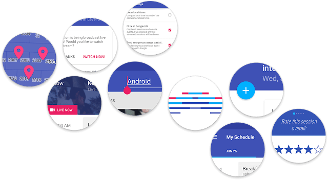
Image: Early Material Design concepts and application mocks showcased at Google I/O 2014.
And what came of it? Twelve years later, what kind of report card has this supposedly universal design system actually turned in?
Samsung, which ships the overwhelming majority of the world's Android hardware, completely ignored Google’s latest Material 3 Expressive push in One UI 8, choosing instead to copy Apple’s translucent frosted glass pixel for pixel. WhatsApp and Telegram, used by billions every day, have spent four straight years refusing to even look at Google’s heavily hyped “wallpaper dynamic color extraction.” Inside Google’s own house, Gmail, Docs, and Sheets were rocking sharp rectangular drawers a decade ago and are still rocking sharp rectangular drawers today. YouTube carved out its own fiefdom with a custom black-and-red UI and ignored the spec entirely. Over in the open-source world, the official libraries for iOS and the web were officially abandoned years ago, and even Google's beloved cross-platform framework Flutter spent 2026 scrambling to rip Material out of its core SDK to keep its distance.
A globe-spanning empire that promised universal consistency over twelve long years has retreated into what? A local sandbox propped up by Pixel phones, a handful of system settings screens, and a suite of proprietary internal frameworks.
This isn't a matter of "design is subjective" or "a noble artistic exploration." From start to finish, Material Design has been textbook Silicon Valley corporate self-indulgence: mediocre aesthetic foundations, self-inflicted usability flaws, guideline authors who flip-flopped on their own rules every three years to harvest promotion credits for mid-to-high-level managers, and all the destructive migration costs dumped squarely on external developers.
01 | A Complete Collapse
If a design system were truly as brilliant as its launch keynotes claimed, the most damning metric twelve years on is simple: how many people are actually still using it?
Lay out the cold facts from official announcements, Git commit logs, and third-party metrics, and what emerges is not an industry benchmark, but an abandoned open-source junkyard:
- Open-source cross-platform libraries in full retreat:
- iOS: In July 2021, the official MDC-iOS repository posted a maintenance-mode notice and wiped all its documentation off material.io overnight. The project lead publicly advised developers to just stick with Apple's native UIKit and SwiftUI.
- Web: In June 2024, MDC-Web was officially deprecated, and the Material Web Components (MWC) library entered maintenance mode. The team went so far as to bluntly state: "Material 3 Expressive will not be implemented for Web."
- Android Native Views: In May 2026, MDC-Android 1.14.0 shipped and was promptly frozen, with all new feature development halted.
- Google's Beloved Framework, Flutter: In May 2025, the team publicly refused to write a single line of code for Expressive. By August 2026, Flutter 3.47 went further, decoupling Material entirely from the core SDK into a standalone package and announcing a pivot to a "style-agnostic core."
- React Ecosystem Leader MUI: MUI, with tens of millions of downloads, kept its issue tracking MD3 support open on GitHub for five whole years. The maintainers delayed it repeatedly, eventually removed it from all roadmaps, and still keep a banner on their homepage: "Material Design 2 only."
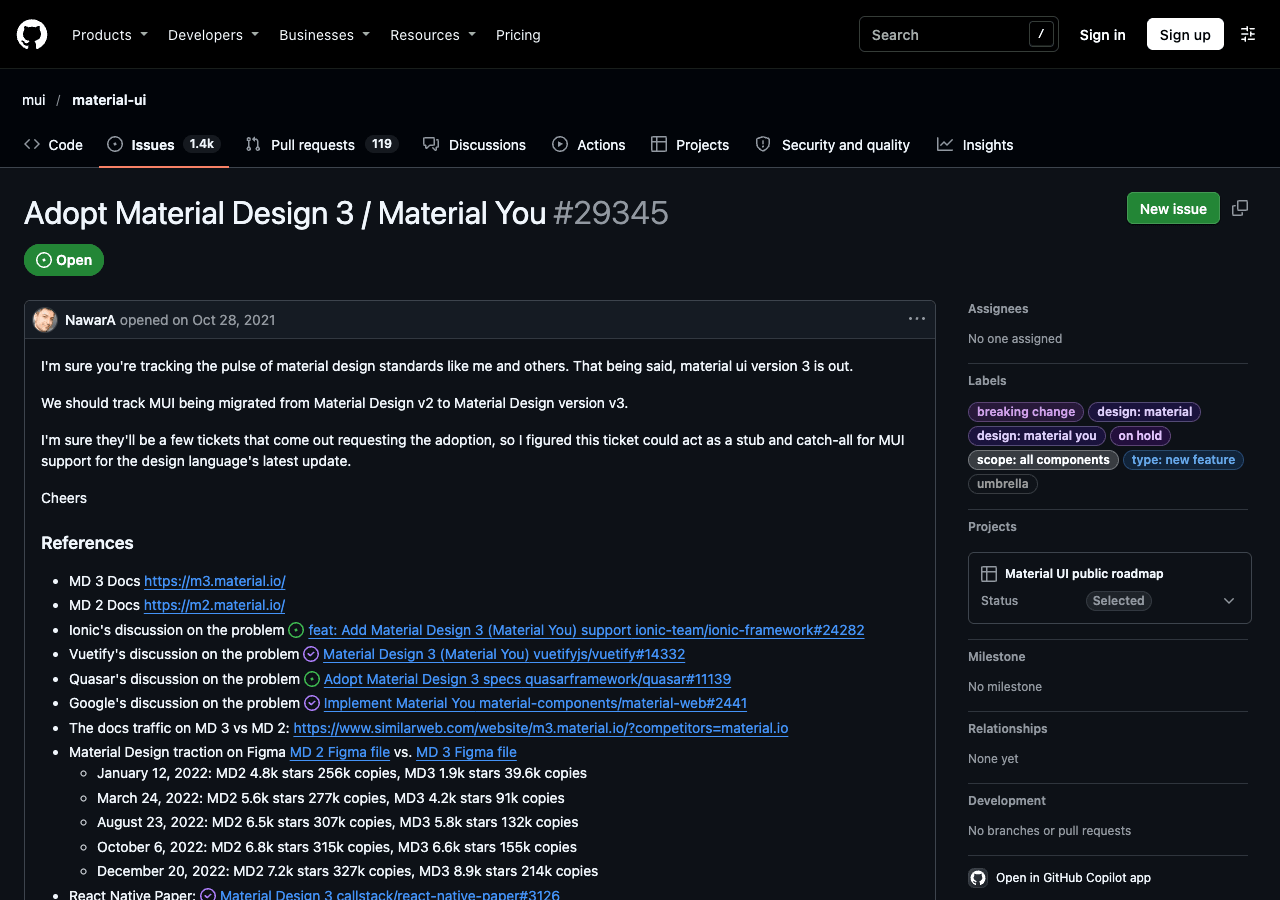
Screenshot: MUI Issue #29345 documents five years of stagnation in third-party ecosystem adoption of MD3.
- Major apps look the other way:
- According to Android Studio data from October 2026, Android 12 and above now powers 77.8% of active devices worldwide. Yet after four years of aggressive marketing for wallpaper dynamic theming, WhatsApp and Telegram haven't bothered to add a single toggle. When Apple introduced a new visual design language, however, both giants adapted within months.
- Hardware leaders vote with their feet:
- Samsung, controlling the hardware gateway for most Android users worldwide, flatly refused to adopt Expressive in One UI 8, giving Google zero leeway.
- Marginalized web icon assets:
- In the web icon library market, Material Icons and Material Symbols combined hold a measly 3.5% market share, while third-party Font Awesome dominates with 88.3%.
From the systemic abandonment of codebase after codebase to the frantic decoupling by Google’s own frameworks, and from hardware titans to top-tier consumer apps giving it the cold shoulder, this supposed cross-platform design language has been dead in the water for years.
02 | A Broken Infrastructure Contract
Before dissecting how ugly or unusable Material Design became, we need to get one definition straight: what does it actually mean for a design system to fail?
A design system is not a conceptual art installation built for an exhibition hall, nor is it a vanity mockup whipped up by a designer on Pinterest. Inside an operating system serving billions of people, a design system is fundamentally an engineering infrastructure contract. Its sole reason for existing is to lower collaboration costs across an entire ecosystem, smooth over the fragmentation of disparate hardware, and provide developers with a stable, durable, out-of-the-box foundation.
When a design system that marketed itself as "digital physics" winds up after twelve years in this state:
- Every cross-platform promise broken by its own creators: Open-source implementations for iOS, the web, and Flutter systematically shut down one after another;
- First-party teams leading the mutiny: Google’s highest-earning, highest-DAU apps preferring proprietary UIs over their own company's design system;
- Platform hardware partners and top-tier ecosystems in collective resistance: Samsung pivoting to copy Apple while WhatsApp and Telegram won't even build a toggle;
- Internal engineers publicly firing broadsides: Former developers who built it calling it "an objective failure" on social media;
- And the captain himself expressing public regret: Matías Duarte, who introduced it to the world, admitting a decade later that its execution was "one of my biggest regrets."
Let me ask: if this doesn't qualify as a failure, what on earth does?
This isn't a "minor compromise." It is an unmitigated engineering bankruptcy and institutional collapse. Far from curing Android’s fragmentation, it dumped salt directly into the wound.
03 | Twelve Years of Self-Sabotage
Looking back at the past twelve years, Material Design’s roadmap reads like a farce: keynotes promise revolutionary breakthroughs, reality leaves behind a mess of half-baked tools, and three years later the company renames the system, trashes the previous version, and promises another revolution.
2014【Material 1.0】
├─ Pitched: Tactile paper & digital physics
└─ Reality: Eye-searing palette & contrast fails
       │
       ▼
2018【Material Theming】
├─ Pitched: Brand customization & visual variety
└─ Reality: Bloated MDC libraries & abandoned goals
       │
       ▼
2021【Material You】
├─ Pitched: Algorithmic color & personal emotion
└─ Reality: Muddy pastels & broken elevation
       │
       ▼
2025【M3 Expressive】
├─ Pitched: Countercultural vibe & kill the boring
└─ Reality: Bloated controls & ecosystem pushback
- 2014 (Material 1.0: The Paper Illusion): Launched alongside Android 5.0 Lollipop under the banner of "quantum paper," attempting to construct visual hierarchy through 3D elevation and cast shadows. Yet the concept was so abstract that Google couldn't even deliver a competent native component library, leaving developers to discover every pitfall the hard way.
- 2018 (Material Theming / M2: The First Reversal): Barely four years in, Google buckled. In the official blog post Making More with Material, the team sheepishly conceded the truth: the old rules were so rigid that every app looked identical, and brands had no room to express themselves. Enter "Theming," an attempt to loosen the reins for third-party brands. But the accompanying Material Components (MDC) library was bloated and painful to migrate to. Before teams could even get their bearings, Google had already shifted the goalposts again.
- 2021 (Material You / M3: Sinking Deeper into the Mud): Shipped with Android 12. Digital paper physics went out the window, replaced by algorithmic color extraction from wallpapers ("Monet"), claiming to hand color choices to users. The algorithm proved notoriously erratic, washing system palettes out in dingy pastels and kicking the seven-year-old elevation shadow system to the curb in favor of "Elevation Overlays"—a tint-layer nightmare that drove frontend and mobile developers up the wall.
- 2025 (M3 Expressive: Off the Rails): On the eve of Android 16, Google ran the exact same playbook. In an official post-mortem, the team admitted that a 2022 internal study found their own apps "too similar, too boring," prompting the release of Expressive. This new iteration bloated controls to comical sizes and tuned animation easing curves into sluggish molasses. This time, the ecosystem didn't even pretend to play along: the Web team refused to adopt it, Flutter refused to write code for it, and Samsung simply ignored it.
Four generations in twelve years. Not once did a new generation fix the technical debt of the last; instead, it tore up past promises, piled on breaking changes, and left developers holding the bag.
04 | Aesthetic Flaws: From Garish Clashing to Corner Chaos
You can't critique a design system without talking about aesthetics. Let's be blunt: compared to Apple, Google's design language has always suffered from an inescapable plastic cheapness.
Apple’s designs have had their share of controversies (from ultra-thin fonts in iOS 7 to the blurred translucency of Liquid Glass), but they rest on rigorous typography engines, Retina anti-aliasing calibration, disciplined lighting tiers, and deep typesetting traditions. Google’s team, by contrast, has never seemed to understand restraint or refinement.
Garish Saturation and Contrast Failures
Pull up the early official color palette from Material 1.0 in 2014, and the scheme once treated as gospel looks like an unmitigated visual disaster.
Back then, Google was obsessed with pairing eye-watering, high-saturation "Deep Purple" and "Indigo" with blinding fluorescent accents like "Pink A200." Screens were drowned in massive unmodulated swaths of flat color, looking like a retro flashback to the early 2000s color-screen flip-phone era.
Worse still was accessibility. Measured against the globally recognized W3C WCAG contrast standards, the official 2014 guidelines recommended pairing white text with Light Blue 500, yielding a contrast ratio of just 2.63:1. Cyan 500 managed a laughable 2.30:1—failing even the bare-minimum 3:1 threshold required for large bold headlines, let alone the 4.5:1 standard for body copy.
When you can't even get basic contrast math right, how do you have the gall to market your work as "the physics of the digital world"?

Image: Official UI examples from the 2014 Material 1.0 spec. The Cyan 500 header with white text on the left scores a contrast ratio of just 2.30:1 (failing WCAG’s 3:1 minimum), while the right displays the fluorescent Pink A200 floating action button heavily promoted at launch.
The Arrogance of CJK Typography
When it came to non-Latin typography—especially the massive ideographic systems of CJK (Chinese, Japanese, Korean)—Google's carelessness was impossible to hide.
The 2014 official typography guide dismissed CJK with an insulting one-line fix: take the Latin type scale and "add 1px to font size, add 0.1em to line height." Android 5 hadn't even bundled the full weight family for Noto Sans CJK yet; while English screens used Light and Medium weights to evoke breathability, Chinese text collapsed into an impenetrable mass of dark strokes.
To make matters worse, the guidelines forced the English "all-caps button" convention directly onto Chinese characters. Square ideographs are already self-contained geometric blocks that have no upper- or lowercase ascenders. Shoving them into all-caps styling produced bloated, awkward buttons with hollow margins and completely derailed visual balance.
Muddy Pastels and Conflicting Radii
Fast forward to Material You in 2021: paper was forgotten, and algorithmic wallpaper color extraction ("Monet") took the spotlight.
We all lived through the result. The algorithm paid zero regard to brand identity or semantic meaning, bleaching every interface in a muddy haze of dull pastels. Serious banking balances and productivity documents were forcibly bathed in drab Morandi tints. Designer @jhaverinator mocked the disjointed palettes on X with a rhyming zinger:
Half of it is red / Half of it is blue / What an inconsistent UI / Is Material You.
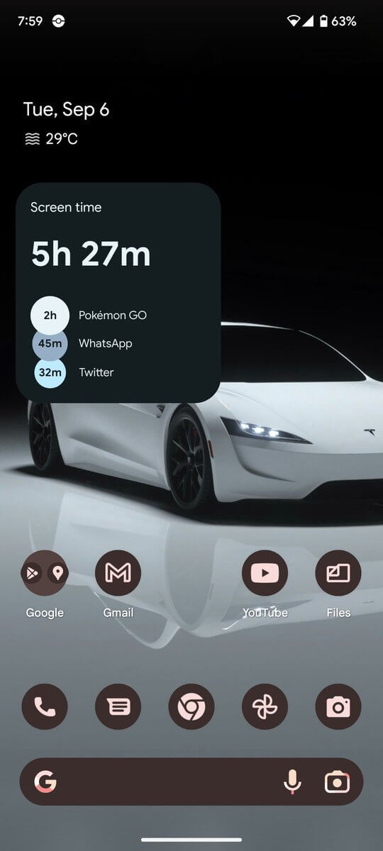
Screenshot: @jhaverinator's original post lampooning the jarring color splits in Material You.
Frontend and mobile developers spent months venting on forums. Under MD3’s Elevation Overlay mechanism, even if you explicitly hardcoded a card’s background to #FFFFFF, the system insisted on blending a semi-opaque tint of the primary color over it for "spatial hierarchy," leaving surfaces looking permanently soiled.
Then came the corner radii. Designer Tom Farrell (@tomfarrell_1) took to X with screenshots of the stock system UI, pointing out four or five wildly conflicting corner radii jammed into a single screen. When you can't even align basic geometric corner curves within your own OS, how do you publish Medium think pieces lecturing the world on design craft?
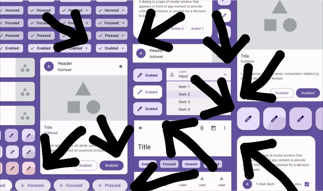
Screenshot: @tomfarrell_1's original post pointing out conflicting corner radii coexisting within the system UI.
By 2025, M3 Expressive abandoned all restraint: controls bloated to swallow half the screen, and spring animations dragged like cold honey. As one Hacker News commenter put it: "People use phones to get things done, not to tap on a giant kiosk at a train station."
05 | Interaction Disasters: Self-Indulgence as Spec
Beyond visual misfires, Material's interaction models reeked of academic designers operating on unchecked arrogance.
The Hamburger Drawer Trap
Early Material treated the navigation drawer like holy scripture. Every app, regardless of architecture, was instructed to tuck primary navigation behind those three little horizontal bars in the top-left corner.
All in the name of a clean canvas, essential navigation was banished out of sight. The cost? Every single time users wanted to switch sections, they had to reach for the farthest corner of the screen, wait for the drawer to slide out, scan the list, and tap—adding layers of interaction friction to everyday tasks.
TechCrunch dubbed the three-line icon "the devil" back in 2014, and empirical research from the Nielsen Norman Group (NN/g) in 2016 delivered a devastating blow: hidden navigation caused content discoverability to drop by over 20%, and slowed task completion on desktop by 39%!
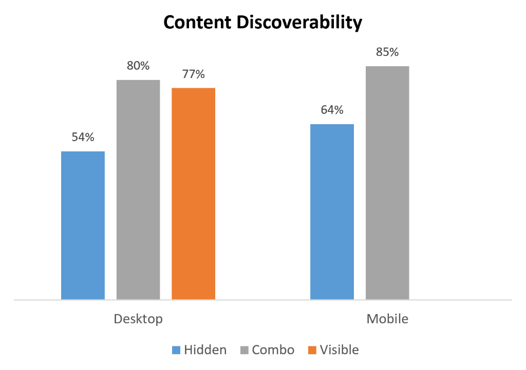
Screenshot: Nielsen Norman Group research proving hidden navigation severely impairs task speed and content discoverability across desktop and mobile.
To satisfy designers’ aesthetic purity on slide decks, user experience and merchant conversion rates across the industry were sacrificed for years, until Google finally gave up and crawled back to the bottom navigation bar.
The Arrogance of the Floating Action Button
The Floating Action Button (FAB) was another engineered catastrophe.
It rested on an arrogant presumption: no matter what the user is looking at, there is only ever one single action that matters on this screen. Singaporean designer Teo Yu Siang dissected the flaw in his 2015 Tech in Asia critique: in Google Photos, the search FAB hovered in the bottom-right corner directly obscuring photo thumbnails; in Gmail, that bright red circle floated on top of the timestamp, star, and label of the last email in the list.
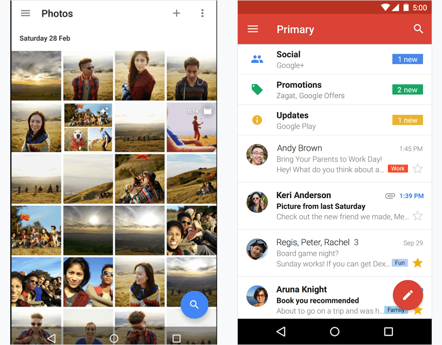
Screenshot: Teo Yu Siang's analysis showing how the FAB interferes with content consumption. Left: Google Photos search FAB covering photos; Right: Gmail's red FAB blocking the timestamp, star, and label on the bottom email.
It wasn't designed to help users finish tasks; it existed to shout, "Look, we're using Material Design!" The ultimate irony? By M3, Google quietly morphed the signature circular FAB into a rounded rectangle—dropping the very geometric symbol they had once preached as revolutionary.
Floating Labels: Shattered Sightlines
The "floating label" text field faced equally brutal critiques from form usability experts. It used the placeholder as the label, which abruptly shrank and flew up onto the top border once focused. As Adam Silver and Smashing Magazine exhaustively demonstrated, this caused label legibility to crater, chopped the form's vertical sightlines to pieces, and left users unable to scan filled versus unfilled inputs.
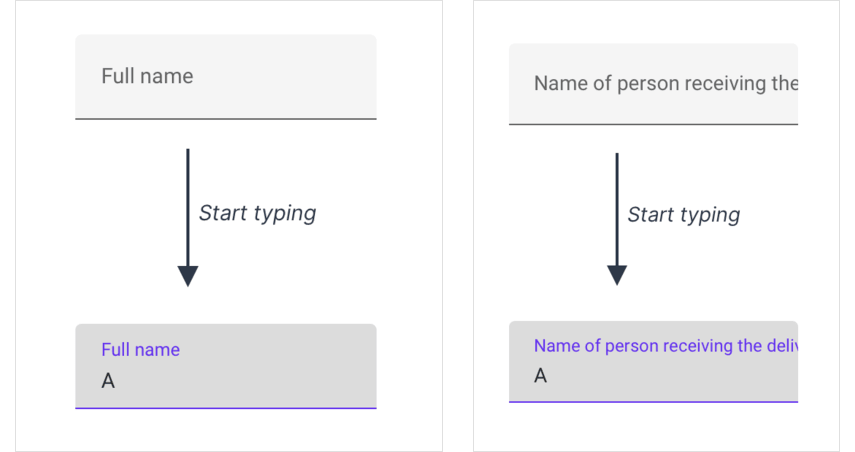
Screenshot: Smashing Magazine / Adam Silver evaluation illustrating the illegibility of tiny floating labels and how longer labels are physically truncated by input borders.
06 | Rules for Thee, Not for Me
If visual and interaction blunders could be excused as well-intentioned miscalculations, Google’s internal behavior laid bare a breathtaking double standard: harsh rules for external developers, total impunity for first-party teams.
Across Google’s campus, the products that actually pulled in revenue and active users voted with their feet:
Fragmented on Day One
In October 2014, right as Android 5.0 rolled out to consumers, Android Police published a now-famous exposé detailing the tenth iteration of Google's inconsistent navigation drawers. The spec explicitly demanded that drawers slide over the App Bar. Yet Gmail, Play Store, Play Music, and Calendar each drew their own thing: drawer heights, shadow drops, and status-bar tints were a fragmented mess from day one.
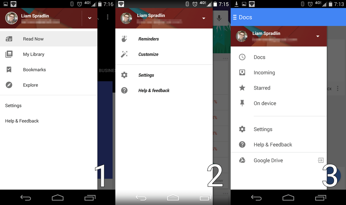
Screenshot: Android Police's 2014 report capturing the immediate fragmentation of Google's first-party drawers upon Android 5.0's launch.
Ten Years Later, Still Squaring Circles
Did things improve over the next decade?
In July 2024, 9to5Google ran a comprehensive retrospective on Google’s core apps. The findings were comedy gold: years after M3 mandated wide rounded corners on drawers, Google Drive had leisurely made the switch, while Gmail—Google's biggest communication app—along with Docs, Sheets, Slides, and Google Chat stubbornly clung to sharp rectangular drawers from an era long past. App bar interactions varied wildly across three mutually incompatible patterns inside the same company.
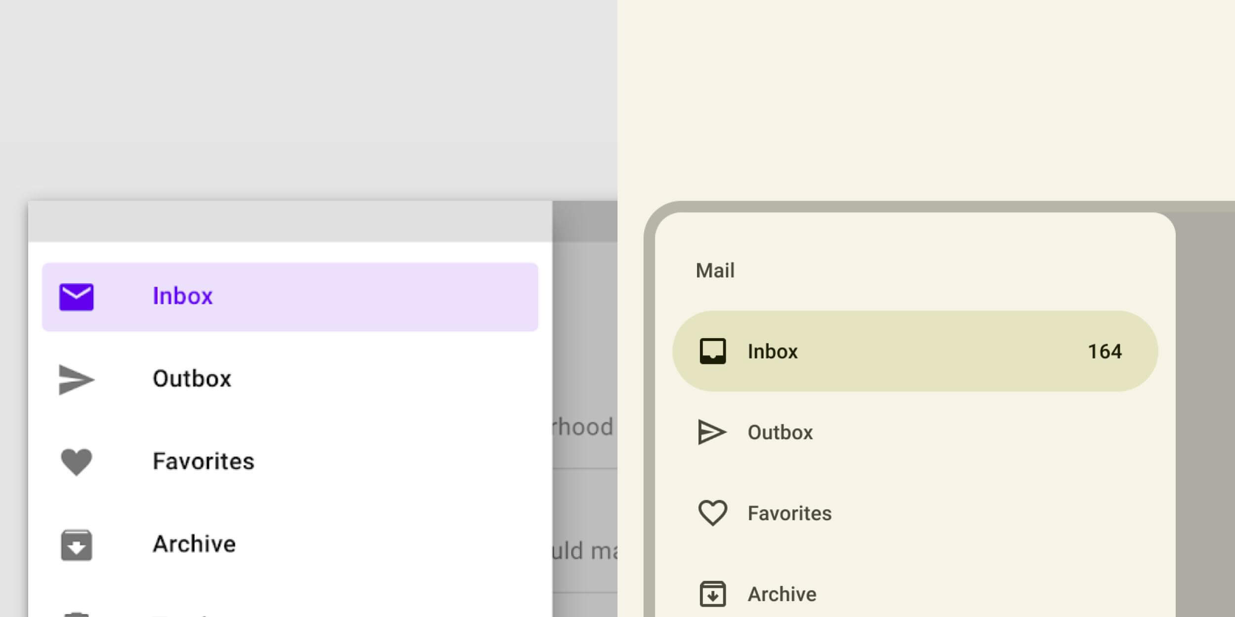
Screenshot: 9to5Google's 2024 review showing first-party apps still split between sharp and rounded drawers ten years later.
YouTube's Kingdom, Maps' Rebellion
By April 2025, 9to5Google published its post-mortem on Material You across first-party apps. The list of exemptions read like an indictment:
- YouTube is an untouchable fiefdom: The main YouTube app, YouTube Music, and YouTube TV maintain total autonomy, running a custom cross-platform design system built around pure blacks and reds, refusing wallpaper dynamic color and turning their backs on M3 components;
- Google Maps rejected dynamic color on principle: Maps blocked dynamic color tinting almost entirely. The reason was blindingly obvious: navigation is a safety-critical utility, and nobody is going to let an algorithm tint lanes and road hazards into pastel pink based on a user’s vacation wallpaper;
- Chrome and Workspace: Hunkered down in hybrid, bespoke UIs while paying lip service to the guidelines.
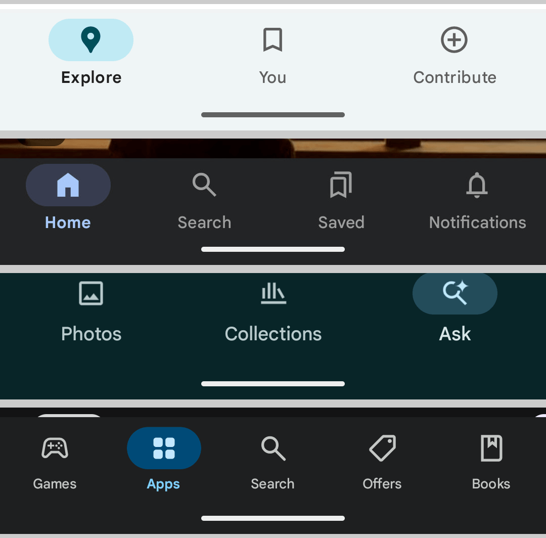
Screenshot: 9to5Google's 2025 review revealing the clashing bottom bars across Google Maps, Google App, Photos, and Play: heights, pill shapes, active colors, and tab counts refuse to align.
                   ┌────────────────────────────────────────┐
                   │    Google Design Pulpit (Mountain View) │
                   │  "One consistent design spans devices" │
                   └──────────────────┬─────────────────────┘
                                      │
              ┌───────────────────────┴───────────────────────┐
              ▼                                               ▼
   【Google's Internal Elites】                     【External Developers】
   • YouTube: Built proprietary black/red UI        • Play Store warning: "Migrate to M3 ASAP"
   • Maps: Banned dynamic color for navigation      • Compose docs: "M2 will be deprecated"
   • Gmail/Docs: Kept 10-year-old square drawers    • Endless breaking changes & unpaid bug fixing
   • Core Web: Dumped open-source for internal Wiz  • Free beta testers footing the rewrite bills
The money-making businesses inside Google knew these guidelines were unworkable in the real world and used their organizational leverage to carve out exemptions. And what about external developers? They were treated like suckers, strung along by official blogs and Play Store policies demanding compliance while Google’s own apps ignored the rules.
07 | The Corporate Disease: Promotion-Driven Design
Dig into why Material Design systematically unraveled, and the root cause is unmistakable: Google’s toxic corporate culture of Promotion-Driven Development (PDD).
This also goes a long way toward explaining why Google’s market valuation and engineering prestige have been challenged or eclipsed by Microsoft, Apple, and Nvidia over recent years. Under Google's internal performance review system, quietly maintaining an existing system and ironing out edge cases earns you mediocre ratings; you certainly won't make L8 or L9 that way. The only guaranteed path to advancement is launching something brand-new: coin new buzzwords, spin up a new initiative, and ship a major rebrand!
Rewrites Are Your Debt, Promotions Are My KPI
Every three or four years, a new crop of design directors and VPs hungry for promotion step up to trash their predecessors' work. They declare the previous system "too boring, too rigid, devoid of feeling," and birth a brand-new spec:
| Era | Version | Official Pitch | What It Actually Meant | Who Paid the Real Bill |
|---|---|---|---|---|
| 2014 | Material 1 | Tactile paper & digital physics | "We are going to end Android's wild west" | The entire industry forced to rebuild elevation and drawers |
| 2018 | Material Theming | Decouple style from functionality | Official confession: "Apps look too similar, brands can't stand out" | Scrap existing styles, migrate everything to bloated MDC |
| 2021 | Material You | Form follows feeling | "It was too cold before, let's make it emotional" | Tokens completely renamed, color system split across two libraries |
| 2025 | M3 Expressive | Boost user engagement | Official survey confession: "In 2022 we realized our apps were too boring" | Ecosystem still choking on M3, handed another tangled mess |
The most comical confession arrived in the official research blog post for 2025's Expressive, Expressive Material Design: Google Research. The authors actually wrote with a straight face that their 2022 internal surveys revealed: "Why did all these apps look so similar? So boring?" Excuse me? You were the ones who forced the entire industry into that mold!
On Hacker News (item 43975352), user greatgib left a comment for the history books:
“Because of material design already lol.”
To justify the latest overhaul, the team rolled out a suite of PR metrics claiming the new system boosted "32% subcultural affinity, 34% modernity, and 30% rebelliousness." When an operating system engineering group relies on pseudo-scientific marketing buzzwords to justify its existence, the farce is complete.
Abandoning Open Source, Retreating to Private Frameworks
On the engineering implementation front, this organizational selfishness was on full display:
- Surrendering iOS (2021): Engineering lead Jeff Verkoeyen published a candid post-mortem on X, reflecting on how chasing the mirage of "pixel-for-pixel cross-platform parity" on iOS led their custom components further away from Apple's native foundations. His core question hit home: "Did we really need to reinvent a switch? Why not just use the system native component and get back to work?";
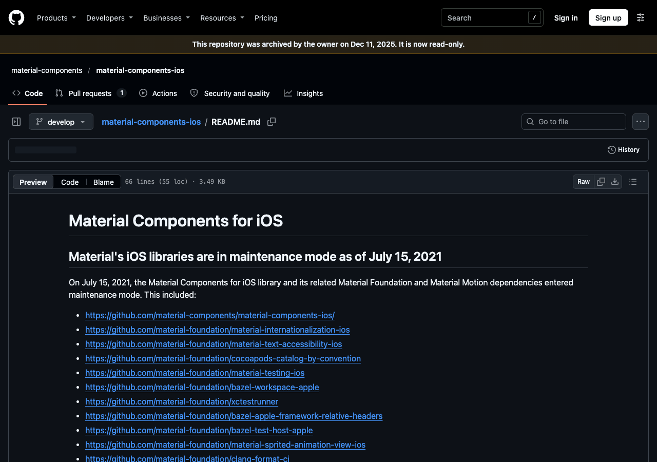
Screenshot: MDC-iOS GitHub README officially announcing a pivot to Apple's native platform.
- Abandoning Web (2024): On GitHub (MWC #5642), the team announced that MWC was entering maintenance mode, with engineering headcount diverted to support Google's proprietary internal Wiz framework. Former engineer Abhinay Omkar revealed that management had zero interest in open-source libraries because they offered "no direct business return for Google." Former engineer taylor-vann went scorched-earth: "Material Web (especially M3) was an objective failure. We were consistently beaten by nearly every alternative, shipping a product years late that nobody wanted to use or recommend";
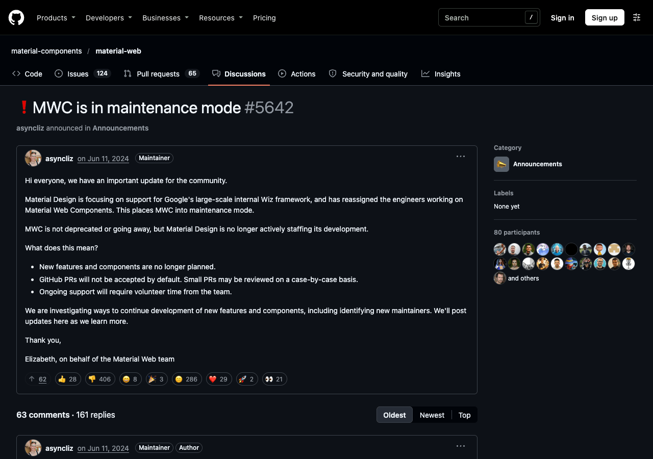
Screenshot: Material Web GitHub Discussion #5642 documenting project abandonment and the reassignment of engineers to internal proprietary frameworks.
- Flutter's Emergency Decoupling (2025–2026): Even Flutter, Google’s own cross-platform darling, had enough. The day after Expressive was unveiled in 2025, the Flutter team announced on GitHub (issue #168813) that they would not build support for it, having endured enough pain during the M3 migration. By August 2026, Flutter 3.47 went all the way: Material was kicked out of the core SDK entirely, paving the way for a "style-agnostic core."
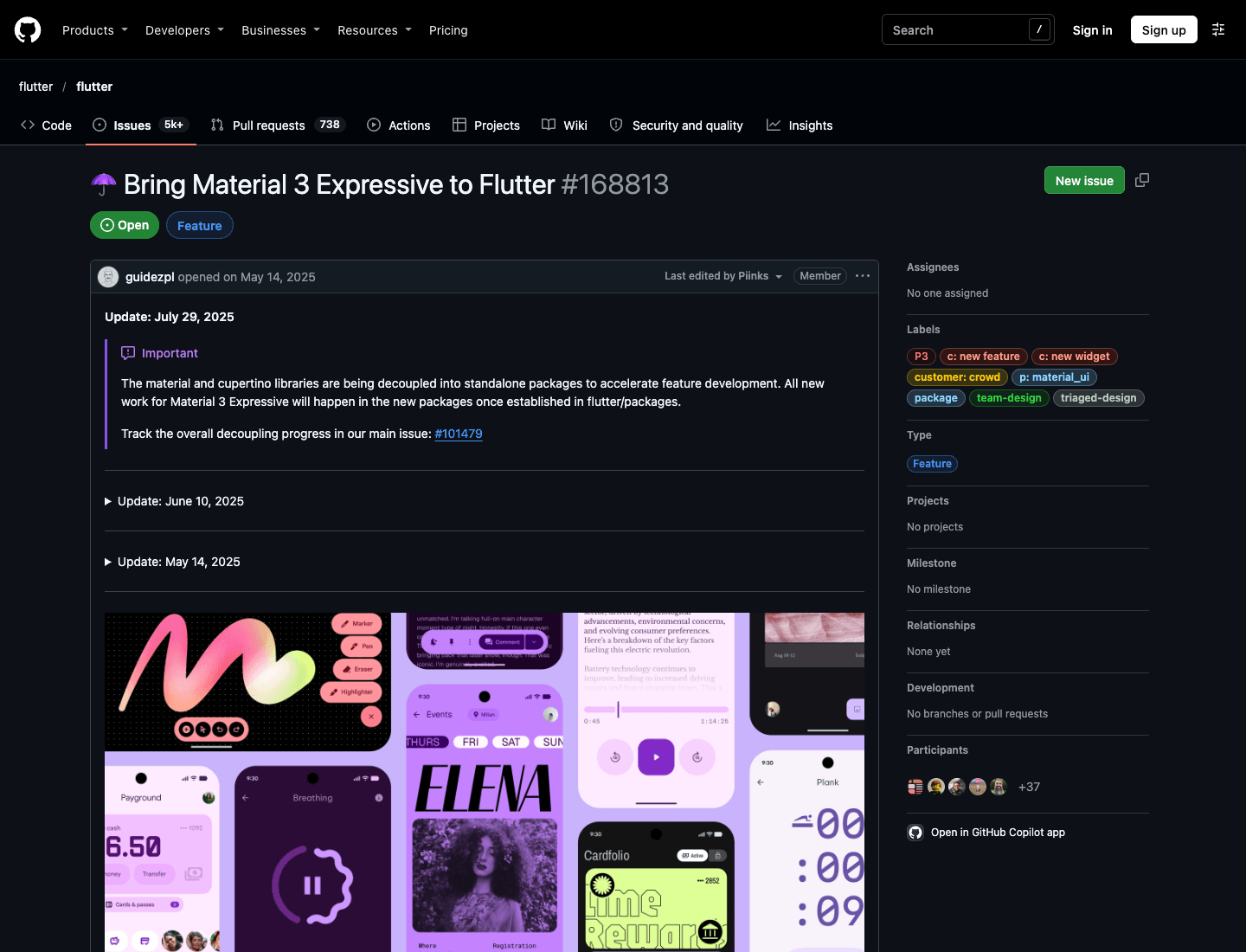
Screenshot: Flutter GitHub Issue #168813 officially declining to support Expressive.
Google's own flagship web products (Search, Photos, Gmail) had long since migrated to their closed-source internal GM3 and Wiz frameworks. To Google, the open-source Material Web code that external developers spent years building on was nothing more than scratch paper to be thrown in the trash.
08 | The Enforcer: Why Apple Can Move an Entire Ecosystem
Whenever this topic comes up, Google defenders rush to point fingers: "Doesn't Apple get criticized too? Remember how people hated the flatness of iOS 7? Didn't NN/g tear into Liquid Glass in 2025 (Liquid Glass Is Cracked), forcing Apple to add a toggle to disable translucency in iOS 26.1?"
Yes, Apple makes mistakes, and Apple takes heat. But why does Apple manage to push its visual shifts across the entire global software industry in a matter of months, while Google spends twelve years shouting into the void and can't even unify its own system settings?
The two companies operate on completely different planes of leverage:
Hard Compiler Contracts vs. Flabby Blog Posts
Apple governs developers through a brutal, uncompromising, yet hyper-efficient compiler and runtime contract.
As documented in Apple’s official guide Adopting Liquid Glass, as long as your app builds on standard UIKit or SwiftUI components, hitting "Recompile with latest SDK" in Xcode automatically activates the new system materials, dynamic blurring, and adaptive ergonomics. Even if you deploy a temporary opt-out flag (UIDesignRequiresCompatibility), the next major OS release hardcodes that flag into oblivion. That is an engineering contract with legal teeth.
And Google? Android’s native android.widget package was abandoned to maintenance mode eons ago. Material Design was never part of Android’s foundational skeleton; it is merely an external collection of Compose, Jetpack, and NPM packages. Lacking both the architectural capability to re-skin apps under the hood and the leverage to enforce compliance, Google is reduced to publishing lofty Medium posts and scolding developers from a moral high ground.
The Chasm in Ecosystem Leverage
In business, incentives determine reality.
Android Authority drew a stinging comparison in November 2025: When Apple shipped a visual redesign, global messaging titans WhatsApp and Telegram updated their native controls within months. On Android, after four years of Google begging developers to adopt Material You, WhatsApp hasn't even bothered to write a single dynamic-color toggle.
In the hardware space, Samsung—commanding the lion's share of global Android devices—chose to mimic Apple in One UI 8, tossing Google's Expressive into the dustbin.
On the phones of the vast majority of real users around the world, Material Design does not exist. It remains an expensive vanity exercise confined to the Mountain View campus and a few million Pixel devices.
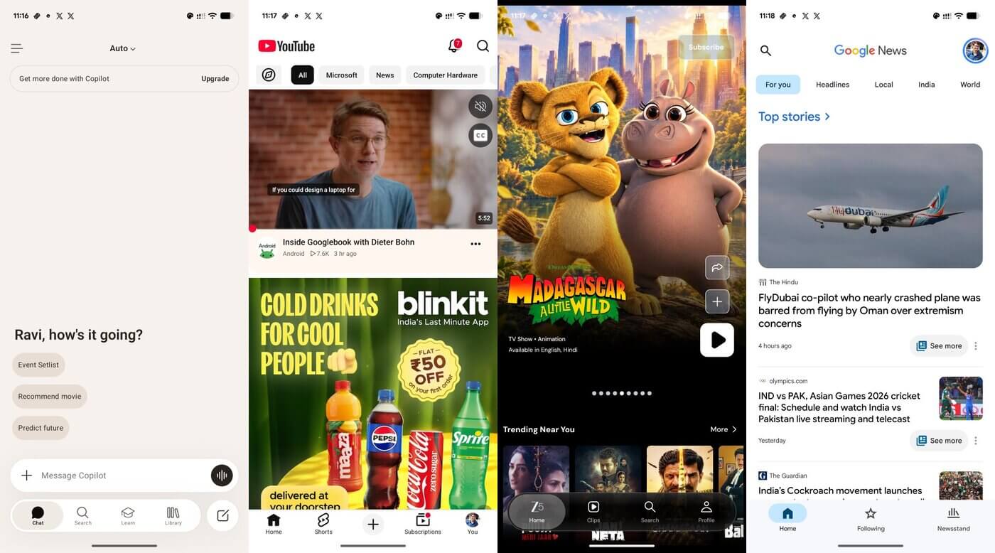
Screenshot: @pixeluibygoogle capturing fragmented UI paradigms across Android 16 apps.
Conclusion | The Curtain Falls on Corporate Vanity
On May 15, 2024, Matías Duarte—who had long since moved on to generative AI research—made a rare appearance on the Design Notes podcast.
Asked to reflect on the ten-year journey of the system he birthed, the design leader who had stood so proudly on the 2014 stage offered what amounted to a formal eulogy of regret:
“In terms of what Material Design actually became, it is one of my biggest regrets… We were overwhelmed by the chaos and ambiguity of the moment, and we didn't realize how restrictive and homogenizing it would become… We solved the immediate problem of order, but the status quo we created ended up being a straitjacket.”
When the creator himself confesses failure, the debate is over.
Material Design was not defeated by a superior outside competitor; it collapsed under the weight of its own corporate narcissism and bureaucratic decay. It attempted to govern real-world software engineering with art-school paper hypotheses and offloaded its maintenance tax onto third parties through three-year promotion cycles. Along the way, it shut down every single one of its cross-platform open-source libraries, while its own highest-earning apps refused to play along.
Twelve years later, the fever dream has broken.
A design system that its own creators ignored, whose own frameworks scrambled to decouple from, and whose founding father publicly mourns as a regret, has no right to call itself an "industry standard." It was simply an immensely expensive, twelve-year performance review disguised as a design revolution.
References
- This is material design (Google Developers Blog, 2014-06-25)
- Material Design Introduction (Wayback Machine 2014-06-29)
- Kill The Hamburger Button (TechCrunch, 2014-05-24)
- The Many Faces Of Google's Hamburger Navigation Drawer (Android Police, 2014-10-30)
- Why the Floating Action Button is bad UX design (Teo Yu Siang / Tech in Asia, 2015)
- Hamburger Menus Hurt UX Metrics (Nielsen Norman Group, 2016-06-26)
- Making More with Material (Google Design, 2018-05-08)
- Material Design text fields are badly designed (Adam Silver, 2017/2019)
- Material Design Text Fields Are Badly Designed (Smashing Magazine, 2021-02)
- Unveiling Material You (Material Design Blog, 2021-05-18)
- Material Components for iOS Maintenance Mode Announcement (GitHub, 2021-07-15)
- Jeff Verkoeyen on Google's pivot to native iOS UIKit (X / Thread Reader, 2021-10-07)
- Migrating to Material Design 3 (Material Design Blog, 2021-10-27)
- ThemeData.useMaterial3 true by default in Flutter 3.16 (Flutter Docs, 2023-11)
- My 8th year at Google: The Material Web Story (Abhinay Omkar, 2024-04-16)
- Facing Our Interfaces: Matías Duarte on Design Notes (Google Design Notes interview, 2024-05-15)
- MWC Maintenance Mode & Wiz Framework Transition (GitHub Discussion #5642, 2024-06-10)
- Google apps still can't agree on navigation drawers (9to5Google, 2024-07-02)
- Reviewing Material You in Google apps (9to5Google, 2025-04-29)
- Start building with M3 Expressive (Material Design Blog, 2025-05-13)
- Expressive Material Design: Google Research (Google Design, 2025-05-13)
- Flutter Issue #168813: Status on Material 3 Expressive (GitHub, 2025-05-14)
- Hacker News: Material 3 Expressive Discussion (Hacker News, 2025-05-16)
- What’s new in Flutter 3.47: Decoupling Material UI (Flutter Blog, 2026-08-12)
- Material Android is Compose-first: MDC-Android Views Maintenance (Material Design Blog, 2026-05-19)
- Adopting Liquid Glass in Apple Platforms (Apple Developer Documentation)
- Liquid Glass Proves Android App Design Is An Afterthought (Android Authority, 2025-11-05)
- MUI Issue #29345: Adopt Material Design 3 (GitHub, 2021–2026)